Sony Xperia Z3+ review
Not as Xperia Z4 but as the Z3+, Sony's latest top model recently entered the European market.

The Sony Xperia Z3+ was previously released in Japan as the Xperia Z4. But even at Sony itself, they realised that the differences with its predecessor were very minimal, which is why its name is different here. That doesn't mean there are no differences, we will track them down for you.
The most important changes compared to its predecessor are a more powerful processor, improved self-image camera and the disappearance of the cover for the USB port. He is also a bit slimmer but this has been at the expense of the battery capacity. Whether all this is enough to qualify the Z3+ as a true upgrade will have to be proven. Sony has already announced the Xperia Z5 which allows it to better compete with competitors such as the Galaxy S6 and iPhone 6s. The question remains whether there is a right to exist for this intermediate?
What's with the device?
Despite the fact that our test model was delivered in a nice flat, square box with illustrations, all that was left was a black microUSB cable. There was room in the box for more accessories, such as a headset and charging plug, but in our case they were nowhere to be found. That does not mean that they are not in the actual sales box.
Appearance
As can be seen from the name, the external changes to the Z3+ are minimal. Biggest progress is the disappearance of the cover for the microUSB input and its displacement to the bottom of the unit. There is still a cover on the left side of the device, but the SIM and microSD card must be placed behind it. For this purpose Sony has come up with a kind of slide in which both cards are located. The necessary mirror is the result.


The front of the aircraft has also been tightened a little further. The slots for the speakers above and below the screen are now positioned completely against the outer edge. On either side of the Sony logo on our white test model are two black eyes for the camera and sensors. In the upper left corner an LED notification light is also just visible.


On the right side are now only the power button, volume buttons and a special camera button. On top of the device we find the headset jack. All this is placed in the metal rim that surrounds the device. However, this is interrupted at the corners by ugly pieces of plastic. The back of the device is completely covered by a scratch-resistant glass plate and is mirror smooth. The Z3+ is easy to handle and because of the slightly convex sides it lies comfortably in the hand. However, for some people it can be on the long side. Because it is still a fraction thinner than its predecessor, it can sometimes be a bit difficult to pick it up from a table.


".
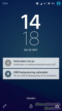
Shortly after the release of the Z3+, stories surfaced about the overheating of the device. This was caused by the Snapdragon 810 processor and could even cause apps like the camera to shut down. During our test period the camera was already equipped with a software update that should prevent this, but it still got uncomfortably hot at the back.

Endurance
Despite the + behind its name, the Z3+ has a slightly smaller battery than its predecessor. That somewhat dampens our expectations for endurance. Not undeserved would soon turn out to be. With a screen-to-screen time of four hours or more it is not possible to fill a day of 24 hours on one battery charge. We don't even use the device as an MP3 player. Our use mainly consists of keeping track of news and social media, synchronizing two email accounts and occasionally opening the camera.
Sony provides its devices with the necessary power management options. Enabling WiFi based on location is no longer available, but background data can still be sent at set times. Furthermore, there is the battery saving mode that we used to slightly extend the life of the last 5% battery charge. You can also set a different percentage and check which functions should be turned off. Then there is the STAMINA mode and Ultra STAMINA mode. In the former, WiFi and mobile data are switched off as soon as the display is switched off. To keep an app like WhatsApp active, it can be added to an exception list. In Ultra STAMINA mode, the functionality of the device is severely limited and only some basic functions remain available. This means that the energy demand is considerably reduced.
Call quality
The interface of the phone application has been changed and disconnected from the phonebook. As a result, it has become a very simple app. When opening, only top contacts and recent calls are visible. With the green button you open the numeric keypad and via smartdial you can find the desired contact. The contact list can be opened by pressing the icon of a head with magnifying glass at the top right. Only then can you also access your favourites.
".
There are a number of additional call settings. For example, there is the Xperia answering machine that records messages from callers on your device instead of at the provider. There are also options such as hearing aid compatibility, slowing down other callers' speech and an equalizer that can be set from normal to clear. We didn't really need the latter because in general we had nothing to complain about the sound quality.
Display
Just like the Z3, the Z3+ has a diagonal 5.2 inch screen with 1920 x 1080 pixels. This is a nice screen that scores well in terms of brightness, color, details and viewing angles. In addition to the standard settings such as brightness and sleep mode, the white balance can also be adjusted. There is also smart-backlight, where the screen stays on when you hold the device and look at the screen. In addition, X-Reality for Mobile and super-life-mode are available for image enhancement. The exact difference between the two isn't entirely clear to us.
".
It is possible to activate the device by tapping the screen twice. This option must be enabled in the settings first. However, we got the strong impression that this function is a bit too sensitive, so the screen is often turned on by accident. The motion sensor that should make the image rotate is not sensitive enough. We suspect that this is due to the smart screen rotation function. This automatically determines when the screen should rotate based on the way you hold it. This option can also be turned off.
Menu
With the advent of Android 5.0, Sony has also made a small metamorphosis to the shell that it covers Android. That was badly needed, as far as we are concerned. This is not so much about the most eye-catching parts like the start screens and the menu, which have remained unchanged. The changes are a bit deeper in the interface, such as the settings menu and the standard apps from Sony that have gotten a lot of design elements from Android Lollipop.
".
For standard Android, the Google Now screen is located to the far left of the home screens, while the manufacturers HTC and LG have incorporated their own application here. On the Z3+ there is no such thing. It is not possible to browse to Google Now from the start screens. This can only be opened by dragging up from the home button.
".
Dragging down the status bar will display the notification screen. This largely corresponds to the standard notification screen of Android. Here small bars appear with previews of messages that can be opened from here or swiped out of the screen. Dragging the notification screen further down displays a box with quick settings. This is also known from standard Android, but unlike the bare Android version, the composition of the Z3+ can be adjusted.
Phonebook
Just like the phone application, the phonebook is pulled tight. There are tabs for contacts, favourites and groups. The list will be filled with your Google contacts as soon as you enter this account into the device. In addition, contacts can be retrieved from a SIM card, Facebook or other accounts. To keep the resulting list organized, sorting and filtering options can be set.
".
By far the most convenient of these is the option to display only contacts with a phone number. In addition, there is the possibility to search for link candidates. This allows you to combine data from the same people from different accounts so that you can link a phone number with an email address and contacts are not listed twice.
Messaging
The messaging apps have also been given a more modern look by Sony. The messaging application is elementary in design but still functional. For example, photos, contact details, location, video, sound, a sketch and an event can be added to a message. By the way, Hangouts can also be selected as a standard application for SMS. In terms of functionality, the email application of Sony and Gmail do not avoid each other very much. They can both access accounts from different providers and display messages in a combined inbox.
Sony's keyboard looks neat but you first have to dive into the settings to quickly access basic functions such as numbers and punctuation marks. Luckily there is a pretty helpful wizard available to guide you through this easily. A maximum of three writing languages can be selected. With smart language detection, the device should then select the correct language itself, but this does not work very well. It is therefore more convenient to disable this function and switch between languages manually with a button on the keyboard. Anyway, the device has a lot of trouble choosing the right words while typing and this gets even worse when entering text by dragging and dropping over the keyboard. Even when you try to work very precisely, it often goes wrong.
Connectivity
Of course the Z3+ has the usual connection options for WiFi, Bluetooth and NFC but there's more. There is a separate section for Xperia connectivity in the settings. Here you can set up or modify settings for one-touch setup, Throw, screen reproduction, screen casting, media server, Windows tethering, DualShock controllers, MirrorLink and USB connection. These are all techniques for pairing your phone with other devices and then playing back media and/or controlling other devices.
".
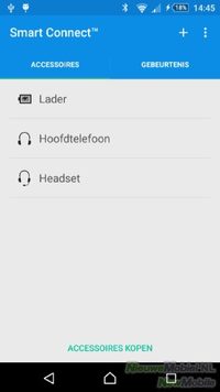
Smart Connect allows you to set actions to be performed when you connect the device to an accessory or other device. You can choose between single or multiple actions.
".
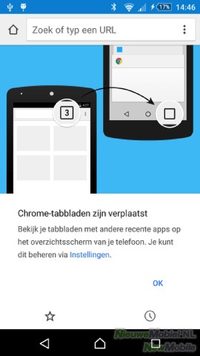
For internet browsing, the Z3+ is equipped with one browser and that is Google Chrome. As far as we are concerned a good choice. The interface is clear and pleasant to use. Sites load smoothly and stably.
".
Camera
On the back of the Z3+ is a 20.7 megapixel camera that we have seen on Sony devices before. If you want a completely new camera sensor, you will have to be at the Z5. By the way, there is an improved selfie camera at the front. It is 5 megapixel and has a 25mm wide angle lens.
".
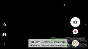
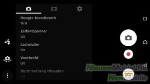
With the physical button, the camera can be started up quickly and easily. The camera always opens in the superior automatic mode. In this mode, the camera determines the correct settings for the best image. However, in that case, photos are not larger than 8 megapixels. The setting options are limited to changing the aspect ratio from 16:9 to 4:3 and switching on the self-timer, smile shutter, preview, photo burst and face recognition.
For more setting options you can use the manual mode but the number of available settings is not very large. Also in manual mode you only have the possibility to select scenes and use HDR mode for resolutions of 8MP or lower.
Other standard modes available are style portrait, AR mask, face in picture, sound photo, AR entertainment, multicamera, 4K video, timeshift video, AR effect, creative effect, wipe panorama, Vine. Especially when recording Augmented Reality and video in 4K, the camera tends to get warm. If things get too cramped, the camera even shuts down automatically.
Because Sony has been using the same 20.7 megapixel camera sensor for quite some time now, the Z3+ can hardly compete with, for example, top models of Samsung and LG. Colors and white balance still look good, but detail and focus are very variable. Due to the limited setting options, this is not easily captured and therefore the sensor is not used optimally. The camera is not bad, but if you want a better camera experience, you will have to look at the Xperia Z5.
Existing programs
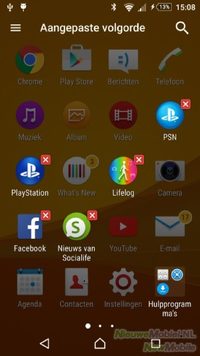
We've said it before, but as far as we're concerned, manufacturers can do better with a limited number of beautifully designed apps that really add something to the user experience. Unfortunately Sony hasn't understood that yet and stuffed the Z3+ as full as possible. The device is equipped with the apps Garmin Navigation, calendar, alarm and clock, album, AVG Protection, backup and recovery, diagnostic data, downloads, Facebook, file commander, fm radio, photos, voice search, Google, Google Drive, Google+, Hangouts, Keep, Kobo Books, national alerts, Lifelog, Live Screen streaming, Maps, movie creator, music, news and weather, news from Socialife, OfficeSuite, Play books/movies/games/kiosk/music, PlayStation, Privilege Plus, PSN, calculator, sketch, Smart Connect, Spotify, support, TrackID, TV SideView, video, Vine, What's New, Xperia Lounge and YouTube.
There are good apps here, but not everyone will need Vine, Kobo Books, sketch or Lifelog. Fortunately, these and a number of others can easily be removed. Unfortunately this doesn't apply to support, What's New, Xperia Lounge.
".
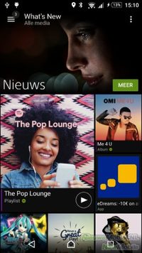
Lifelog is, as the name suggests, a log application. Besides counting your steps and 'measuring' your calories burned, it also keeps track of your activities such as gaming, browsing, taking pictures and interacting with contacts. What's New is a separate app store that seems to focus mainly on games. We haven't been able to discover any real added value here.
Conclusion
A slightly thinner housing, Snapdragon 810 processor and no more cover for the USB connection. These were the most important innovations on the Sony Z3+ compared to the Z3. After having used the device for some time, we can hardly think of a reason to buy it. While Sony is intervening less and less with the interface, they are doing exactly the opposite with the number of apps included. The menu is jam-packed with applications that are superfluous for many people. Luckily, you can remove quite a few of them.
The promised battery life of two days by Sony is far from being achieved when you use the Z3+ normally. Even a full day was regularly too high for us. Sony has not renewed enough on the camera's terrain lately. Competitors like the Samsung Galaxy S6 and the LG G4 now score better. Sony didn't succeed in renewing the Z3+ across the board and in that case the device doesn't make that + worth it as far as we're concerned. Especially considering the relatively expensive price tag.


