Samsung Galaxy S8 review
"Infinitely" burned for revenge
A Samsung phone without a physical control button. That seemed impossible for a long time, but in the meantime it has come to pass.

Where other manufacturers had opted for purely software-based buttons much earlier, Samsung still held on to a real button underneath the screen. Moreover, a fingerprint scanner had been included for quite some time. However, this was a limitation when expanding the screen surface and because a screen as large as possible in as compact a housing as possible is a bit of the holy grail in the smartphone world, the button had to disappear.
Content of the box
Headphones Tuned by AKG
Adaptive Fast Charger (EP-TA20EBE)
USB C cable
MicroUSB/USB C adapter
SIM lock removal tool
Quick start guide
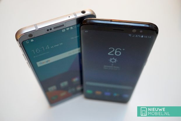
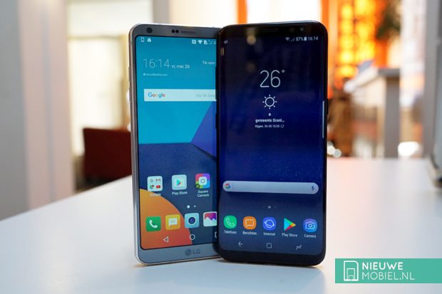
As a result, Samsung has succeeded in placing a 5.8-inch screen in a relatively compact device that is smaller than the Galaxy S7 edge. Furthermore, the camera has a powerful octacore processor, new 8 megapixel self-image camera and 64GB of storage. All this is still in a waterproof and dustproof IP68 housing. The Galaxy S8 clearly has to compete with the LG G6. This one came out just a little earlier and also has a special size screen in the smallest and waterproof housing possible. Sony's Xperia XZ1 is also a formidable opponent, a good comparison between the two can be found in this blog post by Annelies Verhelst.
Design
The S8 arrives at a screen-to-body ratio of 84.8%, which is an impressive percentage. You have more of a screen than a phone in your hands. Above the screen, there is not even room for a Samsung logo anymore. On either side of the ear loudspeaker, there is of course the self-image camera, a number of sensors and a notification light. Samsung likes to give the impression in its promotional material that there is no edge visible at all on either side of the screen, but that is not really the case. Even though it is a thin edge. Especially because the metal on the side hardly sticks out at all. All that screen surface gives you the feeling that you have to be extra careful with the device and maybe you can't even do without a case.
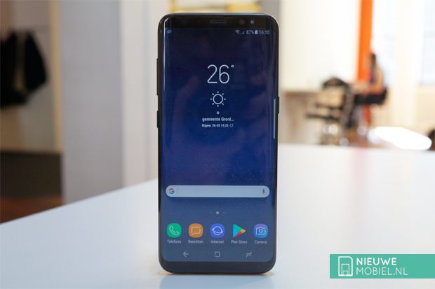
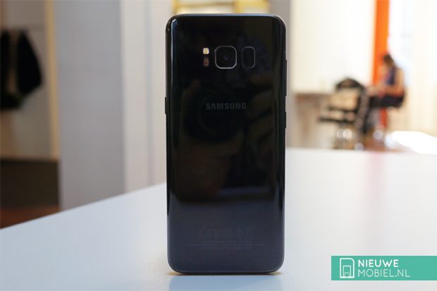
Our test sample was carried out in Midnight Black. This gives it a sleek and somewhat mysterious look but at the same time it's also a lot less obvious that the S8 has a metal body. Because of the glossy finish it looks a bit like it's made of plastic and the industrial look is partly lost.
On top of the device there is the slot for the SIM card which also has room for a microSD card. In the meantime Samsung has also made the switch to USB-C. The port for this can be found at the bottom of the device, with the port for the headset jack and the speaker on both sides. Not the most ideal place, but always better than at the back.
The power button is located on the right-hand side of the unit in a convenient position slightly above the centre. On the left side of the unit there are two more buttons. The upper one is for the volume and somewhat difficult to reach. Right below there is a button specifically for Bixby; Samsung's new personal assistant. If you are not paying attention, activate it while you want to turn down the volume. Since the physical home button had to make way for the larger screen, the fingerprint scanner incorporated in that button had to be moved to the back of the device. There it is placed next to the camera lens. The camera itself is no longer protruding, so the device can lie flat on the table.
.
At the very top of our test device there was a thin slit between the glass and the metal edge where dust and dirt are collected. On the underside this is not the case, but on the backside it is. It's a bit sloppy for a high-end device in this price range. It goes without saying that the back side is quite a magnet for fingerprints. Also, it is not really scratch resistant; our test sample already had quite a bit of usage damage. Furthermore, the S8 feels solid and is comfortable to handle due to its somewhat narrower figure and rounded corners and sides. All that smooth metal and glass just doesn't offer much grip.
Performance
After the debacle with the Note 7 battery, Samsung is of course extra keen not to let something like this happen again. Despite the fact that the screen of the S8 is larger than that of the Note 7, the battery did not grow proportionally. This may be mainly due to a lack of space, but we cannot rule out other motives as well.


With the 3000 mAh battery we came up with a maximum usage time of 1.5 days with a screen on time of about 5 hours. We did have the Always On Display in use but were not constantly gaming or watching video. For a device with the capabilities of the S8 we do not use it all day super intensive and then this is not really a convincing result. If this is important to you then the S8+ might be the better choice.


The setup menu has a device maintenance section. Here all information related to battery, performance mode, storage, memory and device protection is brought together and can be optimized at the touch of a button. In itself a nice idea from Samsung, but you should not get maniacally involved with this by constantly cleaning up the storage and memory.


In the battery overview you can choose between two different energy saving modes. Both screw back the capacities of the device to a greater or lesser extent in order to extend the battery life. Every now and then a notification appears that an app that is active in the background is in sleep mode. Both this monitoring and these notifications can be turned off in the advanced battery settings.


In the interface and control of the system, everything runs very smoothly on the S8. Some apps worked a bit faltering from time to time. This is striking because these apps do function smoothly on older phones. They are therefore not the most advanced apps and maybe that has something to do with it.
Screen
With the S8, the monitor is the part that attracts the most attention. To emphasize this even more, Samsung has also created the term 'Infinity Display'. Besides the minimal space around the screen, the aspect ratio has also been changed to 18.5:9. This makes the screen extra elongated. The maximum resolution is 2960 × 1440 pixels, but the standard setting is Full HD+. That comes down to 2220 x 1080 pixels and we left it at that. There is also HD+ available. The maximum resolution is only switched on automatically when using the Samsung Gear VR or in performance mode. Another novelty are the rounded corners of the image. This has no further function and once you get used to it, they do not really stand out anymore. With the AMOLED panels that we now know from Samsung, image quality is amply guaranteed. Color range, details and viewing angles are very well taken care of.


".
A lot of settings and adjustments can be made in the display part of the settings. Most of them have to do with the interface as well. For the image quality, there is of course the automatic brightness in addition to the resolution. There is also a blue light filter that can be switched on automatically and a screen mode that can be used to adjust the color balance.


Not many apps and content make optimal use of the increased screen space. Simply because they are not optimized for it. In YouTube you can make videos fit, but then part of the content falls outside the screen. In mail and news apps it's of course nice that you don't have to scroll as much.


Software
The skin that Samsung put on Android and lived for a long time as TouchWiz now listens to the name Samsung Experience. We were often critical of TouchWiz, but in the meantime the Samsung shell has finally matured and more customization options have been added. For example, the outer virtual buttons can be swapped to the standard orientation for Android. The shortcut for opening the app menu that was always on the bottom right of the screen can be omitted. Instead, a swipe up or down on the home screen is enough to open the menu.


By default, all app icons are pushed in the same uniform frames but fortunately this can be turned off so that third-party apps just keep their own icon. You can choose to display all apps on the home screens, but we prefer a separate app menu. For both the start screens and the app menu, the grid size can be adjusted.


In addition, the operation of the app menu has been greatly improved and the number of standard apps installed has been significantly reduced. When using the device, you are given the choice to install a number of Samsung apps. The app menu contains three folders for Google, Microsoft and Samsung apps. This keeps things nice and clear. Samsung also deserves a compliment for the way in which notifications are displayed. This is done with a small balloon that folds out at the top of the screen.


".
The fact that Samsung still provides its own Galaxy Apps Store and also uses it to update apps is a bit cumbersome. Furthermore, a peculiar pop-up menu appears when icons and widgets are held down for a long time. This usually works differently in Android and from Android 7.1 you get the possibility to use shortcuts for certain app functions in a similar way. An update for the S8 will therefore create a strange overlap.


".
Then we still have to deal with Bixby. This is Samsung's new personal assistant competing with Google Now. That's why it has been given a very prominent place in the software with the specific hardware button mentioned earlier. To the frustration of many, this can't be set up for another app or application. Bixby Home is a screen to the left of the start screens that, just like Google Now, is filled with maps with information from supported apps such as calendar, contacts, Twitter and news. However, apps from Google are not supported, so you need to download the apps from Samsung for photos, email, internet and music, for example. The device determines when it is useful to display a map. The functionality is currently incredibly limited. For example, the Twitter map only shows 5 trending topics and the map with suggested apps shows 5 icons. For news, you need to use a Samsung channel or download the CNN app. So apart from adjustable reminders, there is no handy automatic interaction with the user we know from Google Now.


The special button can also open Bixby when the screen is turned off. That's a bit odd because that way, memories, calendar and contacts can also be visible to unauthorized persons. The visibility can be adjusted in the settings. Commanding Bixby with speech is not yet possible in the Dutch language. Talking to Bixby in English is not yet possible either, although that will have to change in due course.


".
We don't often talk about it specifically anymore in our reviews, but Samsung's keyboard is a bit disappointing. Spaces were inserted at illogical moments and the automatic word prediction also dropped stitches. It was a pity that the standard Android keyboard was not installed on the S8. Fortunately, it can easily be downloaded from the Play store.
Hardware
Rumour has it that Samsung had plans to process the fingerprint scanner underneath the screen, but due to problems and lack of time it finally decided not to do so. He was forced to move to the back and was turned a quarter turn. As far as we are concerned, they couldn't have come up with anything worse. It's not a place where you can easily reach with an index finger in a natural way. Whether you're left or right-handed. With the right hand it might be a bit easier, but even that doesn't go well because your finger doesn't cover the whole sensor. You have to try several times for both left and right to unlock the device. On top of that, the scanner is hard to find by touch. That is why you regularly put your finger on the camera while wondering why the screen doesn't switch on.


To bypass the fingerprint scanner, you can also unlock the device with the new iris scanner. On sight this works quite smoothly, although sometimes you will have to keep your device in a slightly less natural position and open your eyes extra wide. In less well-lit conditions it should also work well with the infrared exposure, but the camera still has considerably more trouble with it. In addition, it is advised to take off glasses and lenses. This does not make it more user-friendly. On the other hand, the slightly less secure facial recognition almost always works and is also faster.


Instead of the physical home button, Samsung has built in a pressure-sensitive sensor under the screen where the virtual home button is located. For example, if you want to unlock the device while it is lying flat on the table, you can press it and then enter your pattern or code.


The edges of the screen on the S8 look very nice of course, especially in combination with the minimal spaces next to the screen, but its usefulness remains limited. The tabs for the edge menu will not be of equal value to everyone. In any case, we hardly used them. What's more, they cause a small discoloration of the image and reflections on the screen. In addition, they make it just a little harder to open a menu by swiping in from outside the image. The edges should also be able to light up to display messages. Apart from a minimal flicker when the screen is on, we have never noticed this when the screen is turned off.
The screen did not always respond adequately to touch. This may be because our precision leaves something to be desired, but with other phones we usually don't suffer from this. There also seems to be a thin strip of unused space between the main screen and the virtual control buttons. This makes you think you are touching a button, but then nothing happens. The transition from vertical to horizontal scrolling in apps wasn't always smooth either.
At one point, the S8 didn't want to play video anymore. Both online and on the device itself it didn't work anymore. After restarting it twice, the problem had fortunately disappeared. The screen of the S8 is of course ideal for gaming and multimedia consumption. Especially when the screen format is more supported. Unfortunately, the moderate loudspeaker is not enough.
Camera
In fact, the S8 is equipped with the same camera as its predecessor. That is a 12 megapixel with Dual Pixel of which the power was already shown on the S7. The interface has been cleaned and modernized a bit. The camera starts up very fast and also shooting a picture is done in no time. When the camera starts up for the first time, you will get some tips, but still you will have to figure out all the functionality. By swiping from left to right you will see a menu with shooting modes like pro, panorama and hyperlapse. A swipe in the further direction will open a menu with effects like filters, stickers and masks.


In addition to the recording window, buttons for the self-image camera, HDR, flash and settings are visible. The button for the selfie camera is rather difficult to reach with one hand but it can also be opened by swiping up or down. The HDR function can be set to automatic.


There is no separate interface for video recording. As soon as you press the button it starts recording. This makes it a bit more difficult to frame the image properly but you don't have to search for functions and you can also take a quick shot while filming. In the video sizes UHD, QHD, and FHD (60 fps), HDR, effects and AF tracking are not available.


The self-image camera has been enlarged from 5 to an 8 megapixel camera. The camera also has autofocus but not image stabilization. Of course you have the possibility to apply filters for skin color, spotlight, slender face, big eyes and shape correction.


To use all the megapixels of the sensor you need to take pictures in 4:3 format. When viewing them on the screen of the S8 you do not really benefit from the size of the screen. Pictures can be saved in JPG and RAW at the same time.


In the interface of the camera, a button for Bixby is also visible. This opens Bixby Vision. This is a kind of scanner with which objects can be identified. With Bixby Vision you should be able to search for similar images. The found images come from Pinterest and are not very useful because there are no shopping options. The results are also bizarrely bad. Book covers, perfume, deodorant and sunscreen are none of them recognized as such. A watch, sunglasses and computer mouse can still see the software, but model or brand appears to be a lot more difficult.
Foursquare is used for information about monuments and places. Also not directly the most extensive source. Recognizing wine bottles is still the great strength of Bixby Vision. With the help of the dates of the Vinino app you can then learn more about vintage, dishes that match and classification. Detecting text in documents and business cards is reasonable. In the latter case, the data can also be stored directly in the contact list.
Conclusion
The Samsung S8's display is of course its great attraction. A phone with as little space around the screen as possible is considered by many to be the ultimate goal, but whether a screen with an as yet unorthodox ratio, such as on the S8, is also an addition we are not yet convinced of. The edges make the screen optically even narrower and mainly serve to make the device look thinner but in terms of functionality it remains a bit of a gimmick. Nevertheless, the combination of the design and the camera with a renewed interface of the S8 is a beautiful and modern appearance.
Nevertheless, the S8 has two major shortcomings. The first is Bixby. Samsung certainly has big plans with it, but in the Netherlands it is (still) hardly functional. Until it does, Samsung should at least give you the possibility to give the specific button for it a different function.
The second is the location of the fingerprint sensor. After a while, this became a real annoyance. In addition, the recognition of the sensor regularly failed. That simply does not fit with a high-end device from a manufacturer like Samsung and the corresponding price. Fortunately, there are alternatives such as the iris scanner, but they are not immediately faster or more user-friendly. However, if you are used to the convenience and speed of a good fingerprint scanner by now, this can be a real disappointment.

