Samsung Galaxy Note 8 review
Risen from the ashes like a phoenix?
Despite the fiasco with the Galaxy Note 7, Samsung decided to continue the bloodline and release the Note8. Samsung has pulled out all the stops to turn the Galaxy Note8 into a powerhouse. That seems to have worked out quite well on paper.
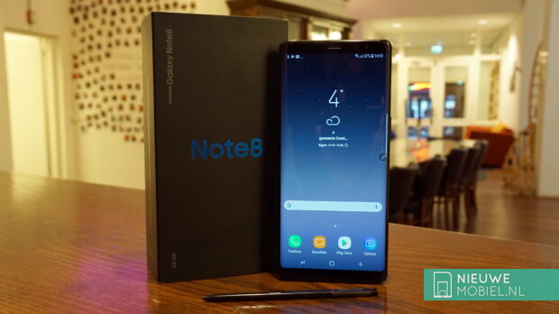
For example, the housing is waterproof, it can be charged extra quickly wirelessly and there is an iris scanner to log in with your eyes. It uses the very latest and fastest processor and has a large 6 GB of working memory. Furthermore, the device has a 6.3 inch screen and dual 12.2 megapixel camera with optical image stabilization.
Content of the box
Quick charger (EP-TA20EBE)
USB-C cable
USB-A to USB-C adapter
MicroUSB to USB-C adapter
In-ear earplugs (EO-IG955)
Set of nibs with removal tool
Quick start guide & warranty card
The Note-devices are certainly no longer the only ones with a big screen and high-end specifications. Think for example of the LG V30, Huawei Mate 10 Pro, HTC U11+ and Apple iPhone X as well as Samsung's own Galaxy S8+. In this respect, Samsung is fishing in a busy pond for the consumer's favour. In this review we are going to see whether they succeed sufficiently in repelling the competition and whether the Note8 actually offers tangible added value compared to their own S8+.
Design
The Note8 is Samsung's largest device and actually just a stretched Galaxy S8 with slightly less rounded corners. This makes it look a bit more businesslike and apart from its size, there's little really striking about it. The curved glass on the front and back is of course present again and the metal edge in between is thin but does not feel uncomfortable. The top and bottom of the unit are completely covered by metal. Just like with the Galaxy S8, our black test specimen looks a bit plastic-like due to the high gloss finish of the metal. The glass on the back is a lot more sensitive for fingerprints than the screen, but that shouldn't spoil the fun. However, it did show some fine scratches. Also, it doesn't seamlessly connect to the metal at the top and bottom, causing all kinds of dirt to get in between.
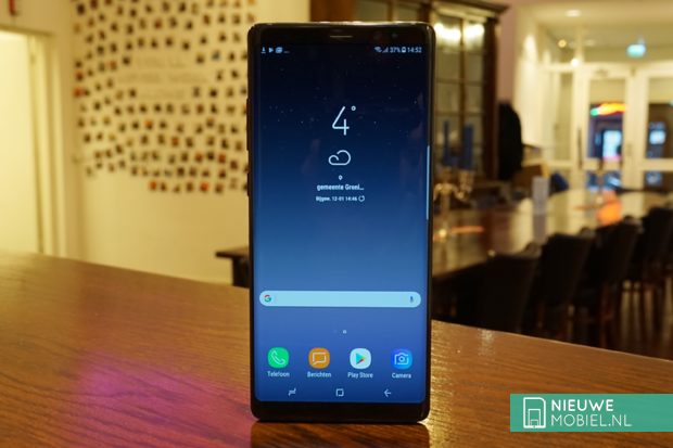
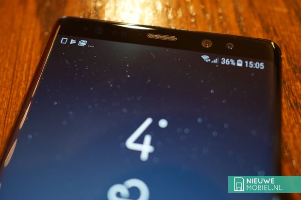
When the screen is turned on, the Note8 jumps a lot more into view. Samsung's Infinity Display blends into the 'edges' on the side, and the rounded corners are also present again. There is still quite a lot of space between the screen and the metal edge of the device. The space above and below the screen is almost equal and offers natural space at the top of the ear speaker. On either side are the self-image camera and various sensors that can be used to unlock the screen. In the left corner there is also room for a notification light. The space at the bottom is completely empty due to the disappearance of the physical buttons.
On top of the device, the SIM card and microSD card can be placed in a tray. The bottom is for the headset jack, USB-C , speaker and of course the S-Pen. With Samsung, the buttons on both sides of the device have been proportionately located in the same place for quite some time. This works out well for the Note8 for the power button on the right side. It is easy to operate with both hands. However, the volume buttons on the left-hand side are in a worthless place for both left-handed and right-handed use. In both cases, you have to hold the device in an unnatural way to be able to operate them. Among the volume buttons is the now infamous Bixby button, which can easily be pressed unevenly when you want to activate the screen with the power button.
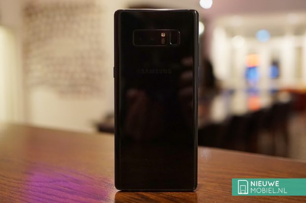
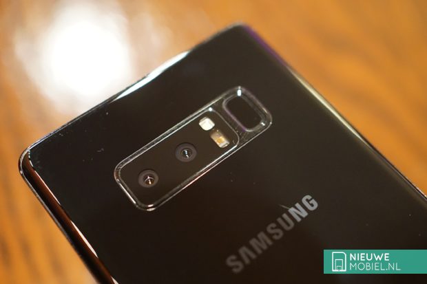
The glass back is mirror smooth with only a small ridge around the camera module and fingerprint scanner. On the Galaxy S8, the location of the fingerprint scanner was already a tricky point, but Samsung surpassed itself at the Note8. The module sits very high on the device, and because the Note8 has a double camera, the scanner is also quite a bit out of center. This is ergonomically a very awkward spot and makes it a lot harder to find with the left hand or for people with smaller hands.
The Note8 is easy to hold with one hand, but for optimal ease of use you really need two hands. That's in the size of the screen but also in the placement of the buttons and fingerprint scanner. It is therefore not a device that we just grabbed 'on the go' to look something up or send a message.
Performance
Compared to the Galaxy S8+, the Note8 has 200 mAh less battery capacity. This is probably because space had to be freed up in the unit for the S-Pen, but it may also have something to do with the Note 7's debacle. Anyway, it is a pity because a screen like that of the Note8 can use all the power it can get.
With a screen on time of four hours, we never got more than 1.5 days of usage time. Of course this is an above average large screen, but still we don't find this very spacious. Four hours of screen usage can't be qualified as intensive use, so we have our doubts if the Note8 will last a busy and long day.
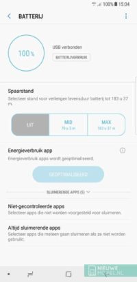
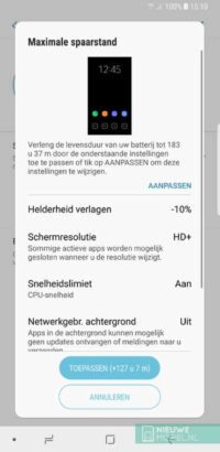
The device does have the necessary options to save battery power and reminds you of this regularly by notifying you that apps have been put into sleep mode. Both this monitoring and these notifications can be turned off in the advanced battery settings. In the battery overview you can choose between two different saving modes. Both screw back the device's capacities to a greater or lesser extent to increase battery life. Every now and then a notification appears that an app that is active in the background is in sleep mode.
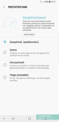
The setup menu has a device maintenance section. Here all information related to battery, performance mode, storage, memory and device protection is brought together and can be optimized at the touch of a button. In itself a nice idea from Samsung, but you should not get maniacally involved with this by constantly cleaning up the storage and memory.
A number of times we suffered from jamming or freezing apps. This happened at Instagram, among others. We experienced something similar with the Galaxy S8 and still have questions about the optimisation of Samsung's hardware, because on paper it is quite okay.
Screen
The Note8's screen measures 6.3 inches diagonally but is particularly elongated due to the 18.5:9 aspect ratio. The maximum resolution is 2960 x 1440 pixels but by default the interface is displayed in a resolution of 2220 x 1080 pixels. Samsung does this in order to save battery capacity, and that did not turn out to be an unwise choice. Only when the Note8 is placed in Samsung's Gear virtual reality glasses, content is displayed in the maximum resolution. You can manually increase the screen resolution, but that is not really necessary. The image is very beautiful. Colors, details and contrast all look very well taken care of. The screen brightness has a large range and can also be very bright.
For image quality there is, of course, in addition to the resolution, the automatic brightness. Furthermore, there is a blue light filter that can be switched on automatically. The degree of yellow discoloration of the image can also be set. Under screen mode the color balance can be adjusted, but in all three, the screener has a visibly redder or yellower tint than in the standard setting.
Furthermore, there is a whole list of options in the display part of the settings but these have more to do with the appearance of the interface than the image on the screen. In addition, the screen can also stay on automatically as long as you look at it. This possibility of "smart slumbering" can be found somewhere else in the settings under advanced options.
Software
The Note8 runs on Android 7.1.1 with Samsung Experience version 8.5 over it. During the test period we received a neat update with the latest security patch but Android 8.0 was not yet available at the time of writing.
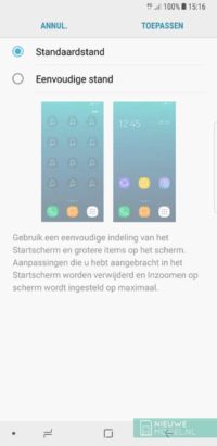
By default, the app menu can be opened by swiping up or down on the home screen. This surprised us at first, because with such a large screen it would be useful to open the notifications window with a swipe down. After some searching in the settings, fortunately this can be done. There are also setting options for the layout and grid of the start screen and a button for the app menu. By default, all app icons are pushed in the same uniform frames, but fortunately this can be turned off so that third-party apps just keep their own icon. You can choose to display all apps on the home screen, but we prefer a separate app menu.
Where Samsung was criticized in the past, including by us, for installing an excess of extra applications as standard, they now take a different approach. For example, there is only a folder with Microsoft apps, LinkedIn and a handful of Samsung apps on the device. The only disadvantage is that none of these can be removed. When you start using the device, you are given the choice to install a number of Samsung apps, such as browser and calculator. However, if you don't do this, it is very difficult to install these apps after all. Samsung does supply its own Galaxy Apps shop, but there is no separate section for specific Samsung apps. A number of Samsung apps use tabs. You can switch between them in most apps by swiping the tabs, but this is not possible in the message and phone apps.
In addition, Samsung uses a separate channel to update its own apps. This does not take place via the Play Store and moreover, Galaxy Apps is a lot less user-friendly. For app updates, for example, you have to enter the settings menu, choose 'My apps' and only then can you update apps. This is not the most convenient method and results in updates being noticed late or not at all. There is an option in Galaxy Apps to update apps automatically but this does not seem to apply to all apps. What's more, almost all apps and features have a battery of settings available that are certainly the most user friendly to search. Even we sometimes lost track.
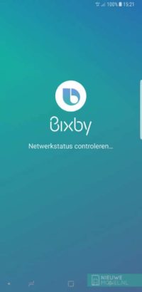
Of course, Bixby is back again. To be able to use it, you have to agree to a large list of conditions. After that, the app doesn't always start smoothly. The overview screen looks quite messy and the information shown is still not really helpful or enriching. For voice control there is no support in Dutch yet, so you have to give commands in English. Meanwhile Bixby can be turned off but the physical button on the side of the device cannot be set for another function. All in all our criticism remains that Bixby is very promising but in practice it isn't yet.
We had a bad experience with Samsung's keyboard before and unfortunately on the Note8 that was the case again. At illogical moments spaces were inserted and the automatic word prediction also dropped stitches. The size of the screen does not make entering text by swiping over the keyboard any easier either. To improve this, however, the size of the keyboard can be adjusted. However, this can only be done in the settings and not during use, so that you can, for example, switch between one- or two-handed input.
Hardware
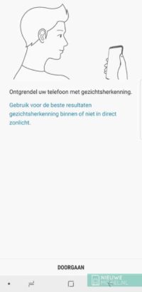
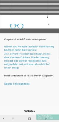
Partly due to the awkward placement of the fingerprint scanner, Samsung seems to have chosen to build in as many additional release methods as possible. Moreover, the fingerprint scanner needs to be completely covered in order to work, which is no sinecure. Besides pattern, code and password, there are also the biometric options face and iris recognition. The face and iris scanner need a moment to recognize you and are reasonably vulnerable to fluctuating lighting. The iris scanner is even more selective. A surprised look with wide open eyes works best but may be a little uncomfortable in public.
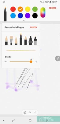
Of course, we also need to talk about the S-Pen. This can be used to write on the screen of the Note8, of course. The tip is nice and thin and the handwriting recognition works well. In text fields you can activate handwriting input by hovering above it with the pen and tapping the key that appears. However, sometimes you have to press the pen quite hard and directed to open something.
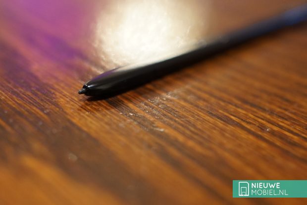
When the screen is off and you remove the pen from the device you can make a note by drawing on a black screen that is largely off. If you remove the pen while the screen is on, Air Command will open. This is a dial with hotkeys for specific S-Pen functions. There are nine of these functions and then there is one place left on the dial for a shortcut to an app. Of course you can also replace one or more of the nine shortcuts with apps. The special S-Pen features are note taking, smart selection, writing on screen, translating, magnifying, quick view, view all notes, live message and Bixby Vision. You can also use the pen to replace your finger.
Camera
The Note8 is the first Samsung with a double camera on the back. One camera has a wide-angle lens, the other has a telephoto lens. You shoot the 'normal' photos with the first one, and you can zoom in with the other one. You can even take photos of both cameras simultaneously so that you can decide later on what exactly you want to zoom in on (Dual Capture mode). Both cameras have optical image stabilization (OIS) which makes sharp photos more likely.
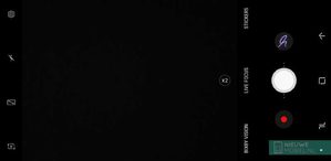
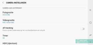
The camera starts up quickly and the interface is nice and clear. Although there are some hidden functions in it. By swiping from left to right, a menu appears with shooting modes such as pro, panorama and hyperlapse. A swipe in the further direction opens a menu with effects such as filters, stickers and masks. Next to the shooting window, buttons for the self-image camera, flash and settings are visible. The selfiecamera can also be opened by swiping up or down. The HDR function can be set to automatic in the settings. There is also a full-screen button, but this reduces the size of the photo to 7.9 megapixels. There is also a button floating in the picture that can be used to switch between the two cameras.
Finally, there is a line with the terms Bixby Vision, live focus and stickers. The operation of these does not change with the rotation of the device. Bixby Vision still doesn't get much further than recognizing the kind of object you have on your screen. Live focus is Samsungs name for photos with a sharp subject in the foreground and a blurry background. You do have to keep the camera about 1.2 meters away from your subject and the camera is also rather picky about exposure. How blurry the background is can be adjusted during shooting, but also afterwards.
The camera(s) produce above average beautiful photos. Exposure, detail and colors look neat. Sometimes the shutter speed is a bit too long to make moving subjects look good. The self-image camera is actually one of the few places where Samsung has opted for simplicity. It is an 8 megapixel sensor that functions fine without too many extra bells and whistles.
Conclusion
If we had to summarise Note8 in one word that would be 'a lot'. You get a lot in your hands. In the form of hardware and functions but also in the form of software. This can be somewhat overwhelming, but Samsung has managed to summarise the distinguishing features of the Note devices in a single device. That this time it will not catch fire. Nevertheless, it is not a must-have.
The Note8's screen offers fantastic image quality with little to worry about except that its high resolution can quickly drain the battery. And it doesn't last very long. In addition, the size of the screen is very large. One-hand operation is practically impossible, even with large hands. The drawbacks will not be the same for everyone, but all in all we think it is a bit much for a device with a price tag like the Note8. Unless you can't miss the double camera and/or the S-Pen, there are devices that are just a bit more manual with better stamina. And a fingerprint scanner that is usable.
Deze website maakt gebruikt van cookies
Aww yeah, you successfully read this important alert message. This example text is going to run a bit longer so that you can see how spacing within an alert works with this kind of content.

