Samsung Galaxy Note 3 N9005 review
Powerhouse pur sang
Wednesday September 4th, during a special event in London, the third iteration of the Galaxy Note together with a matching watch was announced. The new Note 3 is bigger, smarter and more powerful than its predecessor.

The Note 2 is even more similar to the Galaxy S3, the Note 3 is tighter and therefore has its own identity. Samsung seems to have opted for a completely new look with the Note 3 anyway, about which we will tell more later.
Samsung's success with the Note-series has not escaped others either. By now, almost all well-known brands have released their own so-called 'phablet'. Some of them are more successful than others, but it does mean that the Note-series is getting a bit more difficult in today's market. There is the Sony Xperia Z Ultra, the LG Optimus G Pro and also the HTC One Max is fighting for the consumer's favour. Even Nokia has gone overboard and recently released the Lumia 1520 running under Windows Phone 8. Whereas the Note was always relatively expensive, there are now plenty of cheaper alternatives available such as the Acer Liquid S1, the ZTE Grand Memo and the Huawei Ascend Mate. In this review we're going to see if he can stand up to this and if it's worth its hefty price tag.
What's with the device?
The Note 3 comes in a cardboard box with a wood motif. The box seems too small for the Note but it really fits inside. Next to the device we find a charging / data cable, a separate charging plug and an in-ear headset with a total of three different attachments. Also a quick start guide and a manual for using the S Pen are in the box. Especially the cable is a striking appearance. It seems to be a USB 3.0 cable of which the part that fits in the phone is wider than the regular microUSB. Still, you don't have to throw away your old cables, in most cases they work as well. What the advantage of this cable is then escapes us for a moment.
Appearance
As we indicated in the introduction, Note 3 has its own heading. It is tighter than its predecessor and looks a bit like the Galaxy S2. The screen is a bit closer to the edge so there is less space left for the controls. The Note is also thinner. Samsung scraped off a thick millimeter. You wouldn't say it because of its size, but it feels quite compact.


".
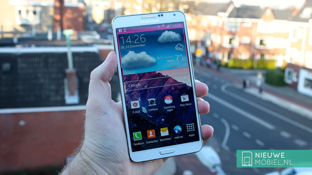
The front is dominated by its large screen. If you have the white version just like us, you will see that there is a light motif over it. Especially if you keep it in the light it is easy to see. At the bottom in the middle is the physical control button with right and left touch-sensitive buttons. As said before, these are relatively close to the screen, so sometimes you trigger an unintentional action. We really don't want to take it out on Samsung, because more space there means an (even) bigger phone. Above the screen are the speaker and the various sensors such as the light and proximity sensor.


".
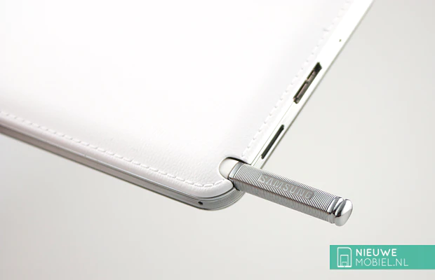
Those who turn the Note 3 will be treated to a pleasant surprise. The back is no longer made of cheap smooth plastic but looks like stitched leather. Even a touch doesn't suggest that we are still dealing with plastic here. It is very nice and somewhere ironic. Just while Apple in iOS is moving away from the stitched leather and skeuomorphic design Samsung is stepping in. Tastes differ but we think it looks good and realistic. It also feels a lot better than a smooth piece of plastic. It also moulds well around the headphone jack and the S Pen input. Next to the Samsung logo, the camera is the only thing you find on the back of the camera.


".
The left side accommodates the volume control. This is one long knob that seems to be made of metal, just like the Galaxy S4. On the right we find the on and off button at about the same height. Anyone else who expects a physical camera button here will be deceived. Samsung is still not working on it. On top is the headphone jack and the infrared sensor. The small dimple is the microphone for when you have it on speaker mode.

At the bottom we find a somewhat peculiar connection. According to Samsung, it is a 'multifunctional' connection, but you can simply connect a regular microUSB cable to it. Furthermore, we find a grill for the speaker, a microphone and of course the S Pen holder. You can easily pull it out thanks to the ribbing on the pen.

Actually, as far as we're concerned, the look is very successful. Yes the Note 3 is big but big is a relative concept that also changes with the years. The iPhone was big when it came out. Now it is small. People who once called to never walk around with a 4.3 inch phone today have a 5 inch one. It's fashionable to have a big(er) phone and it's unbelievable how quickly you get used to something like that. Walk around for a week with a Note 3 and a Galaxy S4 is suddenly small. We have to admit; it doesn't go unnoticed in your pocket, but it doesn't outweigh the advantages of having a large screen, for example.
Endurance
A large screen means short battery life. This is because the screen is the biggest energy guzzler we can think of. However, a large phone also has room for a large battery. Samsung seems to have found the ideal mix, because we have seldom been able to test a smartphone that lasted so long. If you use the Note 3 a lot, surf the internet, watch videos and send messages, you will reach the end of the day without any problems. If you take it a bit slower then two days is very normal. We even got almost three days of non-stop fun once.


".
However, if you are the power-user and there are just a little too few hours in one day, there are several options to squeeze some extra charge out of that gigantic 3,200 mAh battery. The most obvious option is to screw down the screen brightness. There is an automatic mode that can do that for you. You can even adjust it if it's too bright or not bright enough. There is also a setting that can adjust the screen tone automatically. It's something we see more often on AMOLED screens. This too should save energy.


You can also be more drastic. For example, in the special low-power mode, you can reduce the processor speed and switch off the vibration response. If you have activated all these settings, it is practically impossible to have less than 24 hours of phone fun.
Call quality
You can also use a phablet to make a phone call, although with such a large phone on your ear it sometimes seems a bit strange. By the way, that ringing is fine. The sound is loud enough and calls come over without noise. Samsung also works with a separate app for calling and a separate app for the phonebook.


".
This can be a bit confusing because both apps have almost the same tabs. But don't look for log files in the contacts app, it's only in the call app. What's handy, however, is that you can sort under log files by all kinds of desired options. The call duration can also be found there.
Screen
In terms of dimensions the Note 3 is almost the same as its predecessor. Still, Samsung has managed to enlarge the screen; from 5.5 to 5.7 inches. More importantly, Samsung has significantly increased the pixel density by using a Full HD resolution. Although the S4 also uses the same amount of pixels in less space, the individual counting of pixels in Note 3 is an almost impossible task. So the screen is nice and sharp. Just like the S4, the screen is of the type AMOLED, 'Full HD Super AMOLED' to be precise. Technically it is the same screen and therefore we are very positive about the color reproduction and brightness. An additional advantage is that it already reacts with minimal touch. A glove is sufficient in most cases. Handy for the approaching cold.
Menu
The Note 3 runs just like the Galaxy S4 under Android 4.3 but deviates on a few points. For example, tabs in the Note 3 have a more Holo-like design. This makes it seem a lot less amateurish. A reproach that the TouchWiz shell often got. Besides that minimal difference, Android 4.3 really runs like sunshine. The Note 3 is also noticeably faster than the Galaxy S4. Not surprising because inside spins a Qualcomm Snapdragon 800 quadcore processor at 2.3 GHz. Dutch models may have to do without their own Exynos chipset, but that is not a problem for us at all. Moreover, the Snapdragon 800 is a considerable upgrade compared to its predecessor.


Back to TouchWiz; Samsung's own skin on top of Android. Anyone who has ever worked with a Samsung with Android before will immediately feel at home. So don't expect any shocking differences. For example, there are still up to 7 start screens that you can fill in as you like with widgets and shortcuts. The menu consists of a grid of 5 by 5 icons of apps or folders. However, you can also choose a vertical list of apps, similar to names in the address book.


The notification screen has switches to quickly turn WiFi and Bluetooth on and off, for example. Note 3 has a total of 22 switches of this type, but you can choose which one you want to see. No matter how many you choose, they take up to one line. You can then swipe from left to right through them. If you find the presence of the setting to change the screen brightness annoying, you can remove it. All incoming and other notifications are listed below.


".
The screen of the Note 3 is so big that you could easily run two apps at the same time. Fortunately, this is also possible thanks to Multi window. This allows you to decide which two apps you see and exactly how much space they should occupy on the screen. This is a handy feature that we have rarely used in practice.
Phonebook
The contact app of the Note 3 is a list of names conveniently provided with a photo. It extracts the device from logged in accounts such as Facebook or Google. Contacts can be linked so you don't have the same names for all the different accounts. Furthermore, the phonebook knows all the functions you can expect. You can assign different ring tones to contacts and this even goes so far that you can create a different vibration pattern so you can recognize who is calling in your pocket.


".
Messaging
Entering messages can of course be done via the screen, but the Note would not be a Note if you didn't use the special S Pen. This is hidden in the device and after taking it out, some functions are immediately visible via a popup. These are Action memo, Pastebook, Write on screen, S Finder and Pen window. Most of them will be immediately clear, others need something inviting. Some functions are also more useful than others. For example, S Finder allows you to draw a rectangle on the screen after which you can open an app in it. Funny but if it really makes sense? Entering text is not that easy either. You don't have to learn a separate handwriting like you did with a Palm PDA, but it doesn't really work fluently.


".
Perhaps the best way to enter text is via the virtual keyboard. And because a 5.7-inch screen produces quite large buttons, Samsung has come up with something to be able to type with one hand. You can reduce the size of the keyboard and put it in a corner. It is also possible to float it wherever you want. Unfortunately, this option does not work in landscape mode, but in those cases you usually hold the Note with two hands.
Connectivity
The Note 3 has almost the same connection possibilities as the S4. That's quite a few. Of course there is WiFi (including the new and faster 802.11ac), Bluetooth 4.0 and NFC. But you can also use it on 4G (up to 150 Mbps) and there is even an infrared sensor. This allows you to use the Note 3 as a remote control for your television. Samsung supplies a special app called WatchON for this purpose. In addition to simulating a remote control, it contains a television guide. Strangely enough, the most important channels such as Nederland 1, 2 and 3 and the RTL channels are missing here.


".
If you are familiar with it, the presence of WiFi Direct and DLNA are also very welcome. And if you have matching devices you can also reproduce the screen on for example a TV.


".
As far as browsers are concerned, you can choose from your own internet browser, but Google Chrome also comes standard on the device. Which is better we leave to you, both have advantages and disadvantages.
Camera
The Note 3 is equipped with a 13.0 megapixel camera. According to Samsung, the camera shoots the best photos in Automatic mode. However, the results are rather variable. However, results are rather variable. It is very difficult to handle movement. Not only of the camera, but also of objects. Photos are moved (too) fast. There is image stabilization, but it only works in the dark. However, if you are lucky and his pictures are not moved then they really look very nice. Colorful and with a lot of detail.


The interface is child's play. You shoot both photos and videos in the same interface. Photos can be shot in up to 13 megapixels (4,128 x 3,096 pixels). This is a 4:3 ratio. If you prefer 16:9, you can shoot up to 9.6 megapixels (4,128 x 2,322 pixels). In addition to the automatic mode there is a choice of face correction, best picture, best face, sound & recording, drama, animation, golf, rich tone (HDR), eraser, panorama, surround recording and sports.


Especially the surround recording seems a nice addition. It glues several pictures together to get one picture. That sounds like a panorama picture but is different. You can also go in height. The result is just not very accurate. He does not always neatly glue the photos together. You can find an example of this in the photo gallery below.
Existing programs
Samsung has already created some folders with apps in the Note 3. This way, all Google apps are immediately neatly placed in a folder. Samsung's own bloatwareapps are also largely in their own folder. Apps specifically for the Note 3 and especially the S Pen can be found in the Galaxy Plus folder. One of them is Sketchbook. Here you can make drawings or notes in combination with the S Pen. There are various tools and resources available. You can easily adjust the pen thickness and color.


".
Furthermore, the Note 3 bulges out of the Samsung apps and options. There may even be too many of them. The overview even suffers. If this is your first Samsung phone, then it can all be a bit overwhelming. There is also a lot of overlap with some apps. For example, you have three places where you can get apps; Samsung Hub, Samsung Apps and Google's Play Store. We understand that Samsung wants to have its own shop, but why do they have to be two apps?


Extras
We want to go on about S Pen here. You can use it to replace a finger. Some people have difficulty operating a smartphone with a finger or prefer a pen. The Note 3 is perfect for that. And you don't have to use the pen only for creative excesses such as drawings and sketches. Even if it excels in that, of course.


".
Galaxy Gear
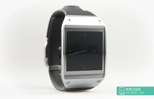
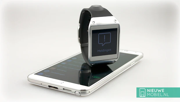
In addition to the Galaxy Note 3, Samsung also announced a smartwatch at the same event. The device is called Galaxy Gear and is the ideal companion for the Note 3, among others. He also works with the Galaxy S4, S3 and the Note 2. That's not very much yet, but you have to start somewhere. Where other smartwatches like the Pebble mainly give notifications you can with the Galaxy Gear clearly more. For example, you can use it to make hands-free calls, take photos and run separate apps. Especially that camera seems like a nonsensical function for a watch, but in practice it's pretty funny.

In the picture the Gear looks pretty big, it is, but we've had a bigger one on our wrist. You can make the strap bigger or smaller depending on your wrist thickness. At the bottom of the Gear there is a thickening which sometimes gets in the way when you're sitting behind the computer. Here is the microphone. The closure is a bit peculiar but feels stable and qualitative. Charging is done by means of a separate holder in which you have to stop the Gear. That's a bit uncomfortable and could have been better and especially faster. Charging should be done with reasonable use every day. You can achieve two days with moderate use but you have such a hypermodern smartwatch of course not just for clock watching.


".
In terms of functions it is (now) not so bad. Of course you have a clock in different themes. There is even an app in which you can build your own theme. There is also S Voice. You enter a command, this is then interpreted by your smartphone and the result is shown on your Galaxy Gear. Unfortunately, S Voice does not work very well, you don't understand in half of the cases and it's also relatively slow. What a killer product the Gear would have been if it would run Google Now! The Gear is most useful for displaying notifications. By now you can show a lot of notifications from a wide variety of apps. Apparently it depends on the app what you get to see. For example, sometimes you only get to see that there is a message, and not the content. Syncing things like read status would also have been very useful. But the Gear is clearly version 1.0. We wouldn't want to declare it the worst product of 2013, but there is still room for improvement. However, we find the idea exciting and are looking forward to successors.

Conclusion
If you look at it objectively, the Galaxy Note 3 is the best Samsung has to offer today. It has the most extensive specification list of all Samsung phones. It's just that its size doesn't make it suitable for everyone. However, do not be put off by this. Get used to everything and that includes the size of this Note 3. Also consider how much extra screen you get in return.
There's a hefty price tag on that. It's worth it, you get value for money. The Note 3 is fast, the screen is sharp and colourful, the battery lasts a long time and there are plenty of apps available. Only the camera is a bit disappointing. Hopefully Samsung will change its mind and put optical image stabilization in its future phone. Here the Note 3 also beats the competition in the same price category. The fact that it shoots video in 4K may be an advantage, but you may wonder what use it is today. Hardly any device where you can play it on.
All in all, Note 3 is a powerhouse of "have I got you there". You may wonder whether this serves the intended target group. Wouldn't they have been better off with a slightly less extensive and powerful phone? A phone with a lower price tag? Again, that price is more than justified, but it's not for everyone.

