Pebble Time Steel review
From market leader to underdog to innovator
We haven't had any reviews about smartwatches here at NieuweMobiel.NL, but this product category is getting more and more popular. And so let's start with an extensive review of the Pebble Time Steel.

Actually, Pebble is the inventor of the modern smartwatch; a product category that has yet to prove itself. Not everyone is convinced of the usefulness of a smart watch and having an extra device that demands constant attention.
Nevertheless, Pebble has proven itself thanks to Kickstarter's community. It's a party to be reckoned with. Moreover, the watch works well with both Android and iOS, although there are some limitations here and there. Pebble's now reach further than just passing on notifications although it excels in that. Because it has been around for a while and there is the possibility to write apps, the offer is relatively large. And the involvement of Apple and Google in this product group will only increase that offer.
With the Pebble Time Steel and also the Time made of plastic, the company has returned to the drawing board. It has taken a new approach to the same problem. What is the need for a smart watch? Pebble thinks, and perhaps not wrongly, that a watch should go around the time. And not just displaying it, but presenting information around a timeline. This distinguishes Pebble from Apple and Google, for example, which have set up their platforms primarily around apps. Of course, these are not unimportant at Pebble, but they are a bit further away than the competition. You may wonder whether that's smart, apps and their offerings break or create a platform after all. In this review, we try to see whether Pebble is smart enough to apply this approach.
Appearance
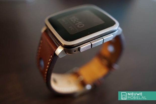
Let's start with the appearance of the Time Steel. Personally, we were not fans of the striking First Pebble. It was big, not very refined and very, especially very plastic. The Pebble Steel changed that. And yet the Steel was quite rough and coarse. Moreover, it was not easy to change straps. And then Pebble released the new Time. Again made of plastic and that just doesn't appeal to a certain target group. Luckily the Time Steel with a more solid metal housing and a slightly longer battery life of 10 days was released. The screen edge of the Time Steel is thinner and the watch is also slightly thicker at 10.5 millimetres. This is not disturbing because it is not completely flat. It forms better around your wrist. The screen is curved this time and that gives a premium feel. This is 2.5D Gorilla Glass.

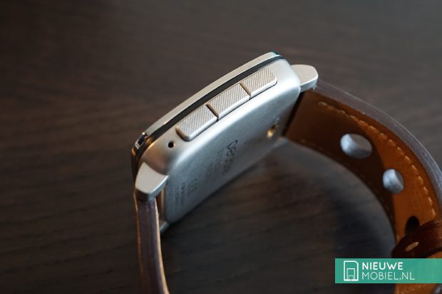
In terms of buttons, there are still the well-known four; left a back button and right up, a selection button and down. These up and down buttons are not used this time to change watchface but serve to scroll through the timeline. More about that later. The buttons have profile at the ends but seem to have some play and are not as tight in the watch as with the Steel. We note that as a negative point.

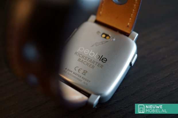
Just below the screen is a black plastic layer that is presumably meant to keep the watch waterproof up to 30 meters. It doesn't disturb and actually looks nice. Anyway, Pebble has paid a lot of attention to the appearance and polished and matt metal alternated. On the right there is a small dimple behind which a microphone is hidden. If you bought the Time Steel through Kickstarter, you will find that proof on the back. A handy feature of the watch is the possibility to easily change 22 millimeter straps. You have official Pebble straps with a quick release closure. You do not need any special tools to change them. Pebble itself has straps of fabric, leather and metal and also in different colors. The watch case is also available in different colour versions; black, silver and gold.

Screen
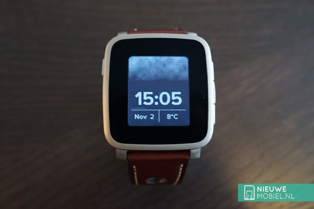
Brief attention to the new screen of the Time Steel. Pebble still applies an e-paper display that is always on and yet consumes little power. It consumes power only when refreshed. The screen goes from black and white to color. We have to nuance that because more than 16 different colors cannot be displayed. In practice, there's a lot you can do with this anyway, and it's reminiscent of the Super Mario era, where the graphics weren't so beneficial either. Switching to colour is a good thing, but it does pose a problem. Colourful watchfaces are difficult to see in the dark because the contrast is lower. Black and white are easier to distinguish. This in itself can be solved by the LED light that can shine but that eats power. By the way, the backlight turns on automatically when it is (too) dark and you raise your wrist. The earlier shaking of your wrist to activate this no longer works. You can set the lighting duration to a maximum of 8 seconds.


Pebble doesn't believe in a touch screen, so Pebble watches differ from Android Wear copies and the Apple Watch. Actually, the screen is too small for that and it is exactly the reason why manufacturers also offer other control options. Apple with the Digital Crown and Samsung with a rotating ring.

By the way, that screen remains the biggest difference between him and the competition. Where the rest chooses a high resolution color screen, Pebble sticks to a low resolution and simple e-paper screen with the goal of a week long battery life. Forgetting to charge for a day is no problem, but you pay for it in terms of image quality. Quite a bit. Any Pebble owner would be lying if he wasn't jealous of the beautiful screen of, for example, the Apple Watch. At the same time, every Apple Watch owner will and should be jealous of the generous battery life of the Pebble Time Steel.
Timeline
As mentioned before, the new interface of the Pebble Time Steel consists of a timeline. You can browse through it with the up and down button. Previously these were used to switch facewatch. Something you rarely did but which often happened unintentionally. You can now browse chronologically through calendar appointments, notifications and missed calls, and it turns out to be a very natural way to display information. Somewhere special is that smartwatch-makers no longer use this approach, it seems so logical to use a device that also serves as a watch.


Apps can also tap into the timeline, although not much is happening at the moment. The number of apps that use this can be counted on three hands at the time of writing. Anyone browsing the timeline will also be treated to cheerful little animations. It looks funny although the practical usefulness is of course zero.


One drawback of the Pebble Time Steel and the whole timeline is where you'll find apps. They're a bit hidden away. You have to press the selection button and a list appears with the settings at the top and the notifications and apps directly below. The more apps you have, the longer you'll be scrolling. This could have been clearer. What's more, it's not clear at a glance which apps you have at your fingertips. So you quickly forget one. That's a pity, because there are a lot of apps on offer and some of them are also quite handy. However, we did notice that many developers have already made their app suitable for the colour screen. Fortunately, the limit on the number of apps you can install has disappeared.
Smartphone app
You won't find the settings on the Time Steel, but in the all-new smartphone app. The app no longer reacts as slow as before and in terms of structure it now consists of 3 parts; Watchfaces, Apps & Timeline and Notifications. In the first tab you can see your installed watchfaces and you can add new ones with a push of the + button.


".
Under the Apps & Timeline tab you can find all installed apps and determine their order. The limit on the number of installed apps has disappeared so the list can become very long. On the third and last tab you can select which apps are allowed to pass notifications. This is handy because previously a separate companion app was needed for this.


Conclusion
The basis of the Pebble Time Steel remains the transmission of notifications and the ability to respond via the watch. This can be done via an emoticon, a predefined sentence or a voice command. The latter is new but does not yet work in Dutch. However, our best English was well understood and always resulted in the right sentence. It does require the necessary pressed buttons to react, even with speech, and in our experience that could have been shorter and more user-friendly. Especially those who have their hands full will find this difficult. In spite of that, the Pebble is very good at passing on notifications, which alone justifies a purchase. Other smartwatches can't match this yet.
The new way of operating has been cleverly conceived and works well in practice but we noticed that we didn't use it much. Maybe it's because our calendar doesn't bulge with appointments or because there aren't many apps that use it yet. In itself that's not a bad thing, the basis is good and can always be improved later on. More convenient in that respect is the possibility to change tapes yourself. Pebble has left the possibility open for so-called smart straps as an extension on the watch, but they still need to see the light of day. Straps that add GPS functionality, for example. That makes the watch a lot more future-proof than say a Apple Watch or Android Wear watch.
Apart from all that, the Pebble Time Steel is just a nice watch to look at and wear. The reactions of others have all been positive so far. Moreover, it is sturdy, waterproof and will last more than a week. That long battery life comes at the expense of a high resolution screen and every now and then that's quite a loss. In the end it is a consideration, it is one or the other. However, practice has already shown that people don't mind the daily charging of a watch as much as Pebble would have us believe.

