HTC One review
Metal versus plastic; who wins?
After a few lean years of declining sales, HTC had to make amends. In order to achieve this, they have been investing heavily in their new flagship, the HTC One, since the beginning of this year.

After the camera was announced in mid-February, final availability was delayed due to a shortage of parts for the camera, and there was also a dispute with Nokia about the technology used in the microphone.
In order for the One to take first place in 2013, HTC not only throws in a sleek and refreshing design, but also a new camera technology and a substantial marketing budget. The innovation is continued in the Sense interface, which is shown on a 4.7 inch screen with 1080p resolution. Nevertheless, the competition with the Samsung Galaxy S4, Sony Xperia Z and Nokia Lumia 920 won't be easy.
What's with the device?
As the HTC One is an unibody phone we do not find a loose battery in the box because it is already in the device. Another consequence of the design of the One is the fact that the microSIM card has to be placed in the device with the help of a small 'drawer'. To eject this drawer, a small metal pin is stuck in the box on a piece of paper with instructions.

We also find some more paperwork in the box, a USB cable with adapter plug and of course a headset. Although HTC still has a partnership with Beats audio, and this is also clearly mentioned on the back of the device, there is no clear reference to it with the headset. It is true that the rubber sleeves are bright red and the cord is flat instead of round, but otherwise the earplugs look rather cheap.
Appearance
Everyone will immediately notice that the HTC One is blessed with a special appearance. It looks very luxurious and solid. This is mainly due to the generous use of aluminum but also because the other materials are processed with precision and it fits tightly together.


".
At the front there are two aluminium strips above and below the screen, each with a grid-shaped recess. Behind each grid is a powerful loudspeaker and at the top also a notification light. Above the screen there is also a camera and some sensors. Above all, there is a lot of space left for the screen. With nice narrow and tapered edges at the sides and two touch-sensitive buttons at the bottom. This is the first peculiarity that HTC has incorporated in its versions of Android phones. Except for the fact that the Home button is in a slightly uncomfortable place, the One has no menu or multitask button. For both functions, HTC had to come up with an alternative that we'll come back to later.


".
The sides of the aluminium are shiny brushed and contrast nicely with the white plastic edge that runs around the device. In this plastic part the SIM card has to be placed on the left side and on the right side there is a metal recessed volume control. Respectively on the top and bottom we find the headset and USB connection.


".
The back has a light, ergonomic bulge and is kept as tight as possible without a bulge for the camera, for example. In combination with the cold metal and its not exaggerated weight, this ensures that the One lies comfortably in the hand. Be careful that it doesn't slip, because the metal doesn't offer much grip.

The One went up to a ten with a griffle for build quality, until we noticed in the light of a reading lamp that the plastic at the bottom didn't connect well with the metal and stuck out a little bit instead. It's minimal but nevertheless detracts from the whole thing. It is to be hoped that other copies will not suffer from this.
Endurance
The battery hidden deep inside the HTC One is a 2,300 mAh one. That is a capacity that the large screen of the One certainly needs. With this, the One is generally quite easy to last a working day. However, 24 hours is quite a task. It goes without saying that on such a day we use the internet and social networks the most, so the monitor is switched on a lot. In addition, we make a single phone call. If you are able to leave the phone in your pocket for a longer period of time, you don't have to worry that you won't be able to make a phone call at the end of the day. Using the multimedia functions of the One has a considerable impact on stamina.
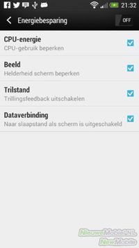
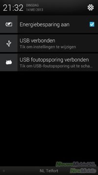
There is a mode that can extend endurance. This function can be set to activate automatically when the battery has less than 15% capacity left, but can also be found at any time in the window behind the notification bar. Saving Mode has the options of restricting processor speed, dimming backlight, or disabling data connection when the screen is off.
Call quality
Except for the abnormally loud ringtone, the stereo speakers do not really have any added value when it comes to call quality. But don't worry, HTC has come up with another trick for this: Sense Speech. With the help of a second microphone that analyses the ambient sound, this functionality ensures that both you and your conversation partner can be better understood.
".
At least, that's the idea. When we phoned in a noisy environment, we could clearly notice that the volume in our earpiece automatically became louder. Sometimes maybe too loud. However, we were also asked to talk louder a few times because our conversation partner had difficulty understanding us. We couldn't directly trace this problem back to the way we were holding the device or the network range, so we have no explanation for it.
Display
The screen on the HTC One has unambiguous specifications. A Super LCD 3 screen with a Full HD resolution of 1920 x 1080 pixels. And because HTC chooses not to enlarge the screen any further, this in combination with a 4.7 inch screen results in a pixel density of 468 per inch. The highest for a phone currently available.
All in all, this provides a very enjoyable visual experience. Of course everything is very detailed but also colours and readability in sunlight are good. The only remark we can have is that the automatic mode for screen brightness consistently provides a relatively bright backlight. This can negatively affect endurance. Finally, the screen is rather elongated, so the angles could be difficult for one hand.
Menu
From the very beginning of Android, HTC was there and with the third device they released on Android, the Hero, Sense was born. This was and is a shell that is put over the regular Android to improve the user-friendliness and appearance of the interface. At the time, this was no superfluous luxury and other manufacturers followed the example of HTC. In the meantime we have reached Sense 5 with the HTC One and below that the device runs on Android 4.1.2. Since the time of the HTC Hero Android has changed and improved dramatically. That's why many manufacturers choose to keep the standard Android interface more and more intact and make less drastic changes. However, this does not apply to HTC. Although Sense 5 is clearly different from its predecessors, the changes have not diminished, on the contrary.
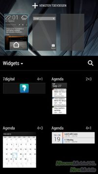
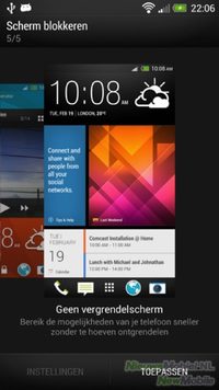
Just to start at the beginning; the start screen. After you've set up your phone at startup using the wizard, you'll end up with an amazingly full start screen, provided you've added a number of online accounts. You have arrived in HTC BlinkFeed. This is a social newsreader and HTC's new take on your phone's home screen. It's right in the middle between Facebook Home and Flipboard. Besides synchronization for Facebook, Flickr, LinkedIn, Twitter and your calendar, you can also display messages from all kinds of news sources here. You have to do with what HTC has chosen for you and cannot add RSS feeds yourself. It's a nice and well-functioning addition of HTC but not everyone will be waiting for it. Unfortunately you can't remove it from your home screen. It is possible not to have BlinkFeed sync but unlike widgets BlinkFeed has to and will take up one of the five start screens. For example, only four of the seven home screens we used to have at Sense are left. Even though widgets haven't given up in size and value. Very unfortunate if you ask us.
".
We'll continue with the application menu. Here, too, things stand out for users who are familiar with Android. The menu consists of a grid of 3 x 3 (or 4 x 5) icons. Actually there is room for 3 x 4 but the top line is occupied by a large clock and the weather forecast. As far as we are concerned, this is a big, if not the biggest, shortcoming of Sense 5. The application menu is meant for apps and not for a clock that is already at the top or a weather forecast for which we can place a widget on a home screen. On the next page of the menu, however, there are icons on the top line.
".
By pulling down the image on the first page of the menu, a number of buttons appear. This allows you to change the way the menu is sorted and there is a search function and a shortcut to the Play Store. On the far right we see three dots that betray that there are more options. Among them is the possibility to adjust the grid size. Strangely enough, HTC still chooses to scroll vertically through the menu instead of horizontally as is now customary on other Android phones.
Then there's the starting dock at the bottom of the screen. It now remains visible in the menu and the apps it contains cannot be found in the menu itself. This breaks the alphabetical sorting if you have set it up. The button in the middle of the start dock lets you return to the start screen. This can no longer be done with the physical back button.
".
Other changes can be found in the settings menu and the overall look and feel of the interface. It has all become a lot quieter and clearer. Many working methods and customization options of the new Sense will mainly require some getting used to by people switching from another HTC or Android phone. For example, when placing a shortcut on a home screen. Pressing the home button twice quickly opens the multitask window with the last used apps in nine windows. Pressing and holding the home button opens Google's interactive and intelligent Google Now search service.
Because HTC does not use virtual function keys and has omitted a physical option key, it can happen that in some apps a black bar with three white dots is visible at the bottom of an image. This button is only visible when it's needed for that app, but because there's no other place for it on the One, it takes up a whole line. Facebook is one such app.
Phonebook
The phone book is also facelifted and tightened in Sense 5, but when it comes to synchronization with online accounts and email, everything is still in the right place. At the time of the HTC Hero this was already very well taken care of and actually HTC didn't give this advantage over other manufacturers anymore. Up to high resolution profile photos from Facebook, everything can be brought in and linked to the right person.
".
Although of course it can be very useful to have contacts from all kinds of social networks in one place, you might want to have access to their phone numbers in your phonebook. That's why you can check the settings to only show contacts with a phone number. With Smart Dial you can then quickly find the right contact.
Messaging
Although the SMS capabilities of mobile phones may be less and less used nowadays, they are still indispensable. HTC has therefore not cut back on functionality. The interface is streamlined and a photo or video but also your location can easily be added.
".
The mailapp that HTC delivers has been significantly improved in Sense 5. Not only does it look sleek and well-organised, it also works more than satisfactorily. The app works fast and messages are grouped neatly. HTC has also worked on the synchronization so that new messages arrive faster when you need them.
".
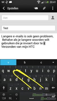
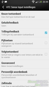
As far as the keyboard is concerned, HTC had lost part of its lead to other manufacturers or to third party keyboard devices. With the HTC One they compete again for the lead. Typing is easy, even with two fingers. The keyboard is fast and can be adjusted to your personal preferences via the settings.
It is also possible to enter words by dragging and dropping over the keyboard but as far as we are concerned you leave this function off and then never touch it again. This works sadly badly. If you want to use it download Swype or SwiftKey.
Connectivity
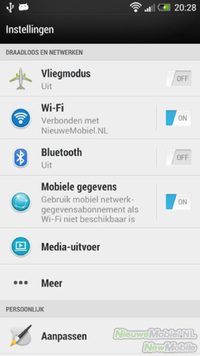
With many other Android phones, as well as previous versions of Sense, dragging down the status bar allowed you to quickly enable or disable WiFi, Bluetooth, and other connection options using switches. Unfortunately, this is no longer the case on the One. Instead, you'll need to resort to widgets or open the settings menu.
".
Apart from this, the One does have all possible connection techniques on board. Think of GPS and GLONASS, 802.11n WiFi, Bluetooth 4.0, NFC and DLNA. Using HTC Sync in combination with HTC Setup you can adjust and set up your phone from your PC the way you want. Files can also be copied from the PC to the device.
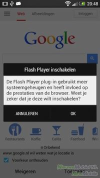
For internet use the HTC One has both Google Chrome and its own HTC browser on board. We soon chose to use mainly the HTC browser. Not only because you then have the choice to play Flash content but especially because it is nice and fast. This applies to both loading and zooming webpages. In addition, you can open a large number of tabs at the same time and bookmarks are synchronized with your Google account. When zooming in or out, text boxes are automatically displayed matching the image. Actually, our only consideration is that double-tap zooms in very far. Fortunately, this can also be adjusted in the settings.
Camera
The camera of the HTC One certainly deserves a little more explanation than usual. As an owner you will have to get used to the fact that you will have to explain many times why the camera of your brand new phone only has 4(!) megapixels. HTC's idea was to exchange megapixels for larger ones in order to achieve better performance in low light situations. Apart from the possible improvement in photo quality, a plus of the technique used by HTC is that the camera starts up very quickly and takes a picture almost without any noticeable delay.
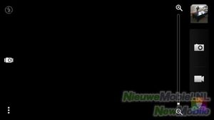
The interface of the camera is clear and straightforward. Keys for gallery, video mode, filters, HTC Zoe, flash and settings are all readily available. To switch to the front camera, you can swipe from the edge to the center of the screen. All necessary options are included in the settings. Sometimes the layout of the menu makes it difficult to find the desired function. Strange is that there is not really an automatic mode.
Now it's time to discuss the quality of the photos. The results are somewhat mixed. The camera performs well in daylight in outdoor situations. Colours are displayed well and the details are also well taken care of. However, there is quite a lot of noise in parts of the photo and there is also a lot of blurring in the edges. In situations with backlight or large contrast differences, it is highly recommended to use the HDR function. When we use the camera indoors or in the evening, we see that the One can excel. Autofocus and shooting are still fast and most photos are well exposed. Leave zooming in at all times because that generally makes little sense with four megapixels.


Existing programs
There are now more than a million apps in the Google Play Store and phone manufacturers are happy to make a selection here to provide a nice total package that consumers can immediately get started with. Some manufacturers succeed in this better than others, but HTC generally has a well-groomed middle ground. The following apps are installed as standard on the HTC One.
".
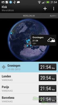
7digital Music Store, Stock, Calendar, Car, Calculator, Chrome, Contacts, Downloads, Dropbox, Facebook, Flash Player Settings, FM Radio, Gallery, Voice Search, Gmail, Google+, Phone Setup, Kid Mode, Clock, Mail, Maps, Music, Navigation, News and Weather, Notes, Parent Dashboard, PDF Viewer, Play Movies, Play Music, Polaris Office, Rescue, Voice Recording, Tasks, Talk, Tips and Help, TuneIn Radio, TV, Twitter, Watch, Weather, YouTube and Flashlight.
The name Kid Mode may speak for itself. This is a rather cumbersome app where children can play games without having to access other functions of the phone. Parent Dashboard can be used to set it up. Why it is pre-installed on the One is not clear to us because not everyone will need it and the app can be downloaded for free from the Play Store.
Extras
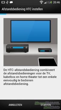
The button on top of the One has another function except as an on/off button; an infrared sensor is hidden in it. Together with the TV app, it can be used as a remote control for your television and other peripherals.
To set this up, you need to enter your zip code and television provider. Then the TV guide can be synchronized with the phone. It's a nice idea but HTC still has to work on the interface, speed and functionality. The idea is similar to Samsung's WatchON on the Galaxy S4. With the exception that multiple television providers are supported on the One.
Conclusion
HTC has clearly tried to keep Android in combination with Sense as simple as possible and they have partly succeeded well. The interface of Sense has a contemporary look again and it is no disaster that the One does not yet have the latest version of Android. Whether or not it will make any delay with updates acceptable in the future is up to each individual to decide. Unfortunately they have added actions for some features. This will require some getting used to, especially for previous users of Android or HTC Sense.
As far as we are concerned, nothing but praise for the appearance of HTC One. This is very well thought out and beautifully executed. Where we consider the small imperfection on our test device as an exception that confirms the rule that the build quality is also well taken care of. Together with the monitor and the other hardware it is a pleasure to have the One in your hands.
The question remains, which phone is better: the HTC One or the Samsung Galaxy S4? That question is not easy to answer. Where the Galaxy S4 stands out in the almost infinite number of functions, the One has remained that simple. You can ask what is better? You won't use a lot of those tricks like hand gestures in practice. Yet the One seems a bit bare in terms of functions compared to the Galaxy S4. Also in terms of performance both devices hardly differ from each other. The One is slightly better in multimedia, but the Galaxy S4 scores better overall. In the end it comes down to taste. If you go for a beautiful appearance, then the One might be the better choice. Although the plastic body of the Galaxy S4 is hardly disturbing.
Finally, we would like to note that in principle we can appreciate a countermovement in the race to stuff more and more megapixels into the camera of a mobile phone. HTC deserves a compliment as the initiator. On the one hand, their attempt with the One works out well, but on the other hand, it also has expected consequences for the photo quality that are not to its advantage. The battle in this area is therefore probably far from over.


